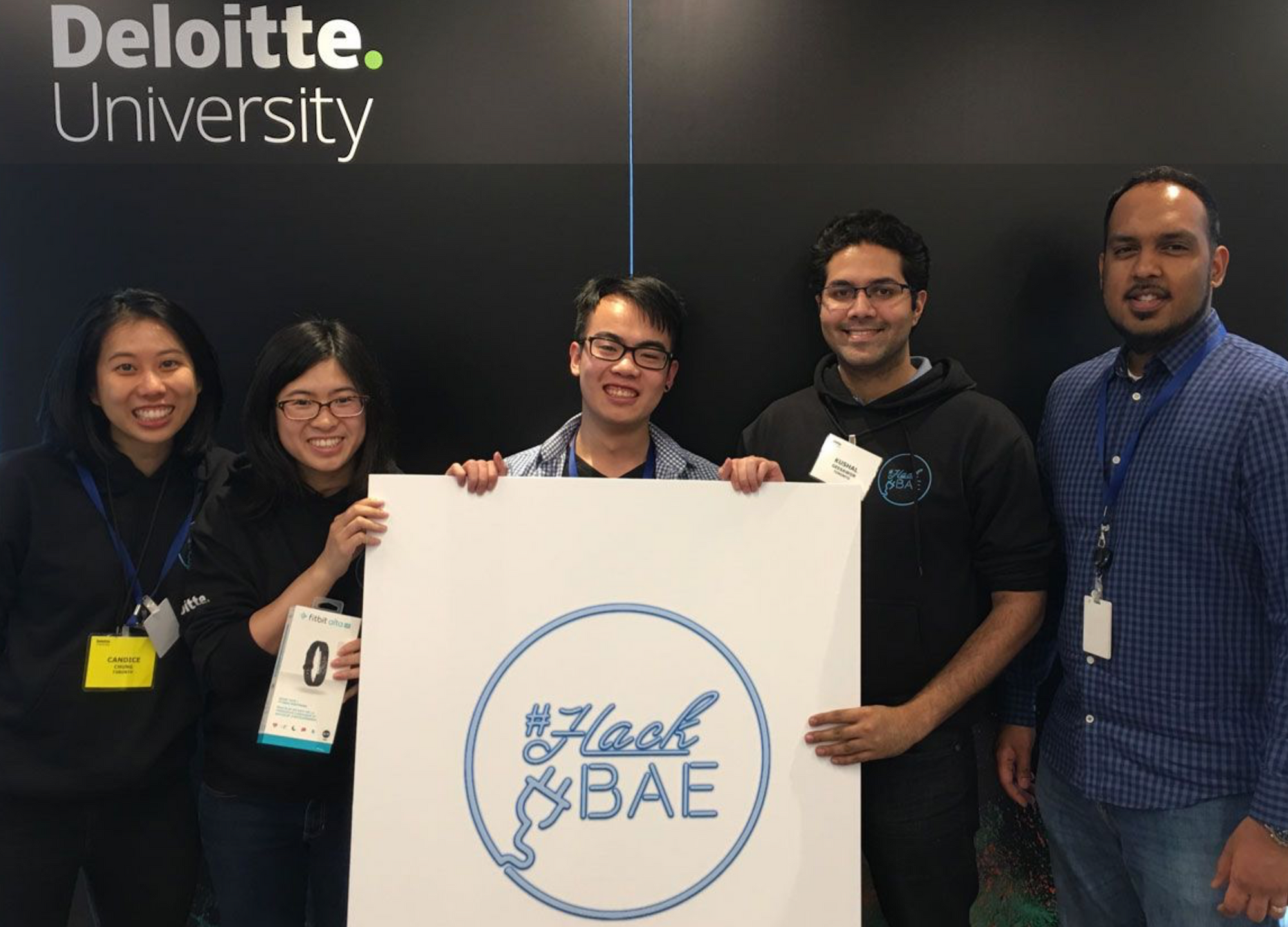
During my internship at Deloitte Toronto, I had the opportunity to design a system to solve their workspace management problems.
Presenting to a panel of judges, my team and I won the HackBAE design competition (named for their new office at Bay Adelaide East) with our solution: BAE Seatfinder!
Read on to see how we tackled the project.
Background
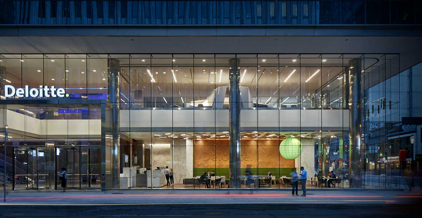
Bay Adelaide East was envisioned as the flagship of Deloitte Canada's operations and implemented many new innovations in office design to accommodate the workforce. One of the key new features was a free-office concept where employees wouldn't have assigned seating.
All employees would work on their laptops which they could plug into monitors on desks. This was designed to reduced wasted space as a portion of employees were consultants and would spend days to weeks at client sites, leaving many empty desks. While this did solve that problem, it also decreased the usability of the office, leaving many employees frustrated.
Much of this dissatisfaction came from employees not having places to work when they were in the office. By conducting user interviews with our colleagues, and leveraging our own experiences working in the tower, we narrowed down the true issues with the office.
Problem 1: No visibility into where free desks are
For anyone who arrived even slightly after 9 a.m. sharp, finding a seat is a time-consuming and frustrating process. Without any information on where open seats were, people had to gamble. They would select a random floor and search for an open desk.
Found one? Jackpot! All full? Next floor!
If they're unlucky, this search can take upwards of 30 minutes. Combined with the frustration of walking in circles like a hawk and failing to find your prey, tons of productivity was being bled away.
Without any knowledge of where open seats are, this process was time consuming, frustrating and universal. Every single person out of the 24 employees we surveyed talked about their difficulty with finding seats. (I personally managed to talk the design team into letting me use their dedicated area with the big 4k monitors)
Everyone generally took one of three "solutions".
- Gamble & search
- Arrive earlier to beat the rush
- Give up and take seats at non-desks (e.g. in cafeterias, coffee areas - places without dual monitors)
Option 1 wastes employee time, option 2 exacerbates the problem for latecomers and option 3 can greatly reduce work quality (Much of the company often works on large excel spreadsheets).
Problem 2: Hard to collaborate if you don't sit next to your team
Even though the company is on Skype, nothing beats in-person communication, especially for complex problems.
Since you can't consistently sit in the same area or even floor, a quick "hallway conversation" with a teammate can be a daunting task. Imagine yanking out your laptop, walking 100m in dress shoes and going up three floors to show your manager something on your screen.
While this forces a portion of conversations online, it also converts some desk-side chats into full blown meetings, with booked meeting rooms. This led to the much worse issue of a meeting room shortage for the entire office.
Altogether, it was hard to form a sense of community. Your environment would change every day and it was hard to both collaborate and form connections.
Problem 3: People won't give up their seats
It's a war for the good seats, which means that people weren't keen to relinquish their hard-earned spots. This was because workspaces doubled as storage spaces. There wasn't anywhere else to put your effects! Especially in the harsh Canadian winters, jackets needed to stay somewhere.
Consultants would set down their clothes and effects at a desk and that would be "their space" for the day. It didn't matter if they went out to lunch or had all-day meetings - their stuff would stay. This quickly became problematic when prime dual-monitor desks would sit empty all day as coat racks.
Deloitte had repeatedly tried to use office communications to discourage this practice but was ultimately unsuccessful. The super dynamic system which was originally envisioned quickly became a very static one.
Solution
It would be easy to do a hand-wavy solution and just say something like "add more floors" but we still wanted to make the best use of any space. To do this, we needed to start with an office inventory system. We cannot manage anything without an understanding of which space was open or filled.
While there are literally hundreds of companies that provide this as a service, none of them were designed to handle the ephemeral nature of our seating. This why we had to build something new that was cheap, intuitive and fit well into everyone's existing mental model of the office.
This lead to the first part of our solution: QR codes on every available workspace. This was an easy way to create an inventory of every available space while also allowing self-reported check-ins through a companion app.
Our BAE Seatfinder app written in Apache Cordova would scan the codes to inform our server of occupancy.
Use Cases
You had two choices when you come into the office. You can either:
1. Have the app check you in
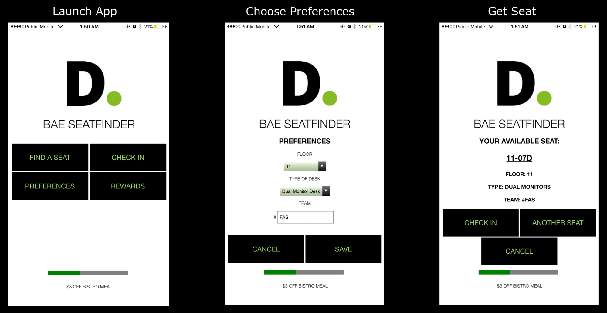
You would input your preferences of floor, type of desk and team. The app would then assign you a seat which matched these preferences as best as possible. Once assigned, you had a short period of time to get to the seat and scan the QR code to check in.
2. Settle in an open seat and scan the QR code at that desk
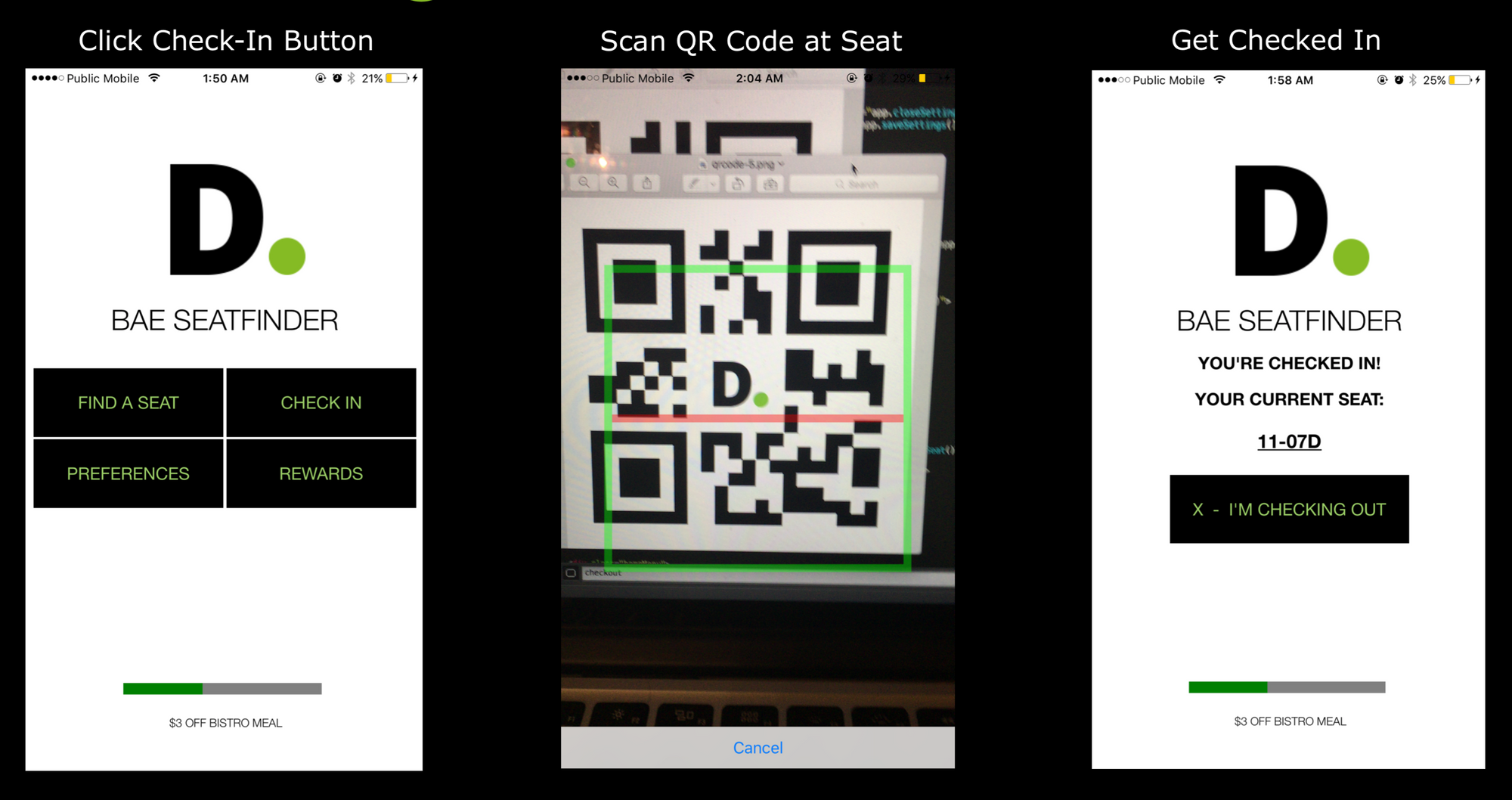
Alternatively, you could also scan the QR code at an existing seat to check yourself in.
The intention with these two flows is to create as little discord as possible with everyone's existing seat-finding methods. If you're an early bird, you can continue your normal routine with a painless five second check-in. Conversely, if you were a gambler or a cafeteria squatter, this would be a great opportunity to give the app a chance.
To ensure no one tries to cheat the system, the app will only work if connected to the office wi-fi.
Encouraging Checking Out
Once you check in, a seat is yours for the entire day. It didn't make sense to fight human nature here - nobody wanted to move all their belongings from place to place.
However, what we could do was add incentives to check out of a seat. The building had a cafeteria called Bistro that was popular with the employees so we designed a system to reward you for voluntarily relinquishing your workspace. By offering coupons that accumulate whenever you check out of a seat, we hoped to convince some employees.
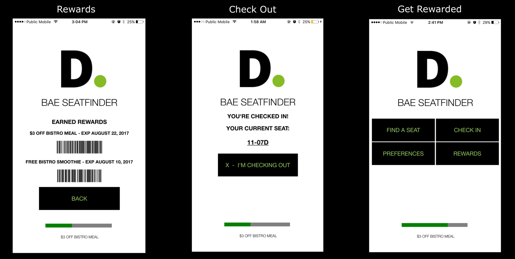
Furthermore, the improvement in employee confidence to find another seat through the app would help voluntary vacations. If you knew that you wouldn't have to search for half an hour to find another desk, it would be less of a risk to release your current one.
Better Collaboration
Another key feature is the ability to sit in proximity with the rest of your team. By putting in a hashtag, say #TeamAudit, it would try and assign all members as close to each other as possible.
You can also change this anytime, making it useful for different use cases. If you need to work with a single colleague, you might temporarily change your hashtag team to a new one that only contains you and your colleague.
This simplicity improves usability and really accomplishes the goal of creating communities in the office even if there's no fixed seating.
Rollout
To drive adoption, BAE Seatfinder had a multi-phase rollout plan starting with a pilot program.
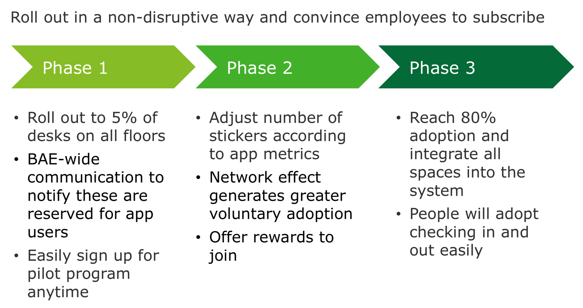
Open enrollment by employees will help us gauge success and resolve issues that arise in implementation. Once we've collected enough data, we would be able to scale.
Once fully implemented, BAE Seatfinder is designed to ensure that employees will keep using it. If you forget or choose not to sign in, the system would assign your seat to someone else. This means that you'd keep getting pestered by people after you've occupied your seat. Rather than having to rebuff everyone, it would be easier just to check in. By leveraging peer pressure, we would ensure continued usage.
Conclusion
To me, the most important factor in designing a system is usability and the judges at HackBAE agreed. We had impressed them with our thoughtfulness in developing a solution that worked to organically grow new employee behaviour instead of trying to force a completely foreign solution. As one judge later told us:
I liked that you didn't force technology just because you could. It's important that solutions work for the users and not the other way around.
From our win in this competition, we were able to bring our design to a panel of partners at a quarterly meeting. By using the concepts we developed, the company will resolve the space sharing headaches at Bay Adelaide East.
