In the summer of 2020, I worked as a product manager intern for Credit Karma on their credit cards team. Our mission was to make the process of shopping for new credit cards as easy and tailored as possible.
During my 4 month internship, I drove the project to overhaul their user reviews platform. It was a popular product with lots of potential that had sadly fallen into disrepair. By introducing new technologies and forming a relationship with a third party vendor, we were able to revitalize and launch the new user reviews product.
Starting from a small investigation, it quickly snowballed into a top priority project for the company backed by a full team, funding and a multi-year roadmap. Here's how it happened:
Background
Every credit product offered on Credit Karma has a standalone user reviews page. Anyone could leave a review and the platform allowed for some simple filtering/sorting.
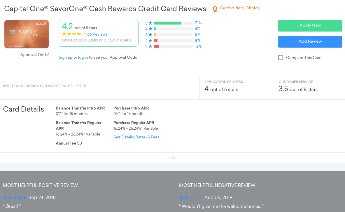
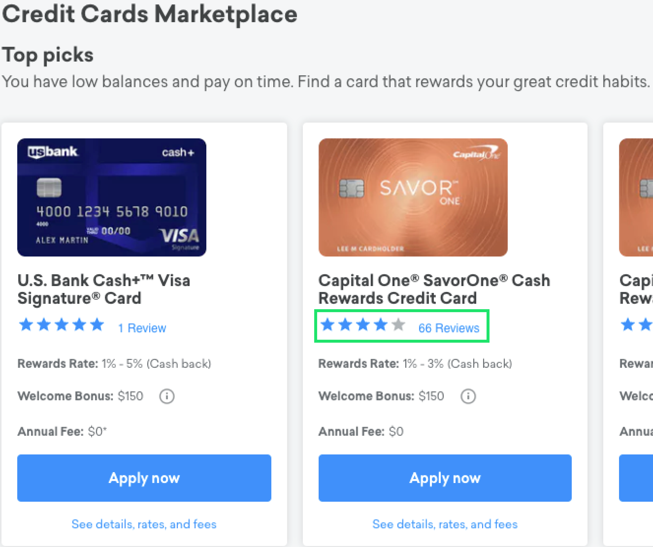
Despite its low-key profile, reviews was a prominent part of CK's product. Anytime we showed a credit card offer on desktop or mobile, there would be a link to the the item's review page on the star rating.
When I got there, reviews was in a major state of disrepair. The last time it received an update was in 2016 when we modernized the UX. Most of the code had been at CK since 2011. It continued to chug along but its age was starting to show, dragging down the user experience on Credit Karma.
Not only that, there was a pressing deadline coming up. Jan 1, 2020 was when the California Consumer Privacy Act would come into effect. Our reviews platform was not compliant and we would be fined if we didn't add new user privacy features.
We needed action and we needed it quickly. I took charge of the project to overhaul our platform in 4 steps:
- Investigate - Find the true values & problems of user reviews
- Plan - Develop a product strategy and roadmap
- Campaign - Get the company on board with the plan
- Execute - Develop the new product
Step 1 : Investigate
Two camps of thought had deadlocked all action on reviews for the last four years:
User reviews is still doing well so we don't really need to change it
User reviews is a useless relic and it's not worth the investment to fix so we should just nuke it
I had to investigate and determine which course of action was correct.
And as it turns out, they were both partially right. After a lot of data diving and A/B testing with our data scientists & SEO team, I was able to form a much clearer picture of the situation:

A brief breakdown:
Popular
The click rate-through rate to these pages was high. For logged-in users that applied for a credit card on Credit Karma desktop, more than 40% checked user reviews before applying! Our customers trusted our platform to give them real opinions from other cardholders.
Having been one of the first online properties with user reviews for credit cards, these pages also ranked high in organic SEO without any investment. Our reviews pages were frequently in the top 3 results when you search "X card reviews".
Effective
On top of that, these pages were highly effective in helping customers make their shopping decisions. These were personalized testimonials that described details in an individual's experience.
I ran an A/B test where we removed the star ratings and link to review page from our offer tiles. This tanked conversion rate by up to 43% for many of our cards, leading to overall revenue loss of 52% for the variant (cards most heavily affected were premium high revenue cards).
The data also showed that reviews revenue purely from SEO (user landed on the page from search engine) accounted for 3.1% of the total credit cards revenue per month on average. I can't disclose numbers here, but this was worth several millions of dollars each month.
Unrealized Potential
Most importantly, there was lots of unrealized value left on the table. Our customers actively seek it out and it has great traffic, but it's isolated from the rest of Credit Karma. Its whole presence on the platform was as an afterthought. We've never tried featuring the content.
In addition, evidence showed that better UX improved reviews collected and reviews consumed. Data from the 2016 refresh showed 15% more traffic and 8% boost to conversions in the before/after despite no new functionality added.
***
Now, the downsides:
Tech Debt
Even without the mandatory new CCPA features, our user reviews pages were already buried under a MOUNTAIN of tech debt. Credit Karma had moved from a monolith codebase to a microservices architecture and user reviews remained one of the last unmigrated properties.
The company refused to develop on the existing reviews codebase because it was fated to be thrown away. Being on the old codebase also meant that we couldn't do A/B testing or advanced analytics on the reviews pages.
No part of the old code was worth saving either - a brand new backend & frontend was the only way forward. After conducting an engineering evaluation with our developers, it showed that this would take minimum 3 quarters with a full team. Migrating old reviews and adding new features could easily stretch this into a year-long effort.
Unmanaged
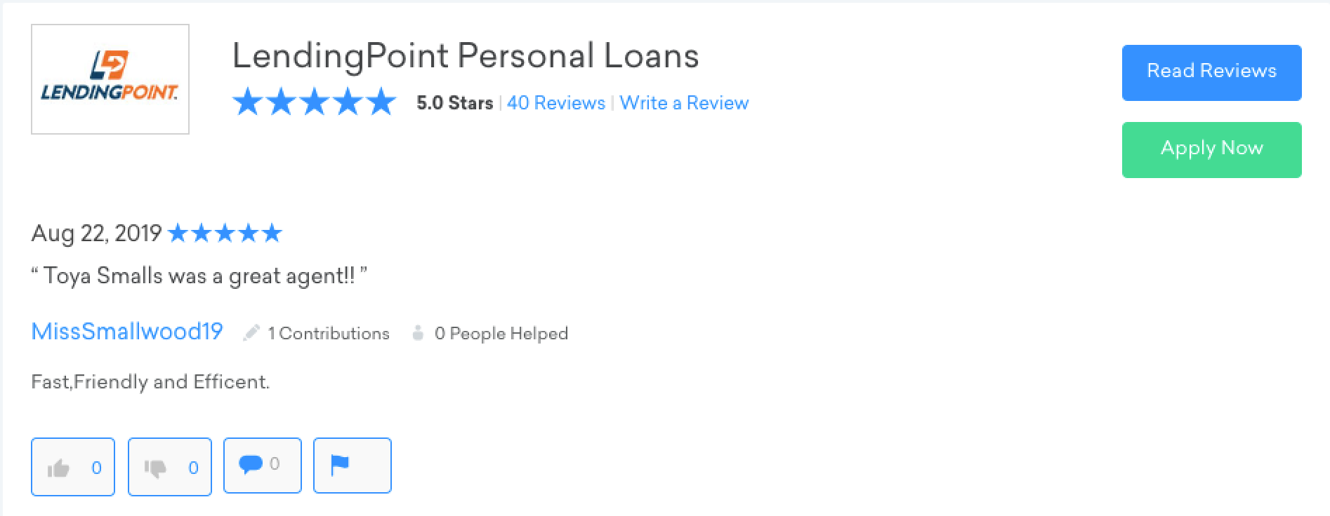
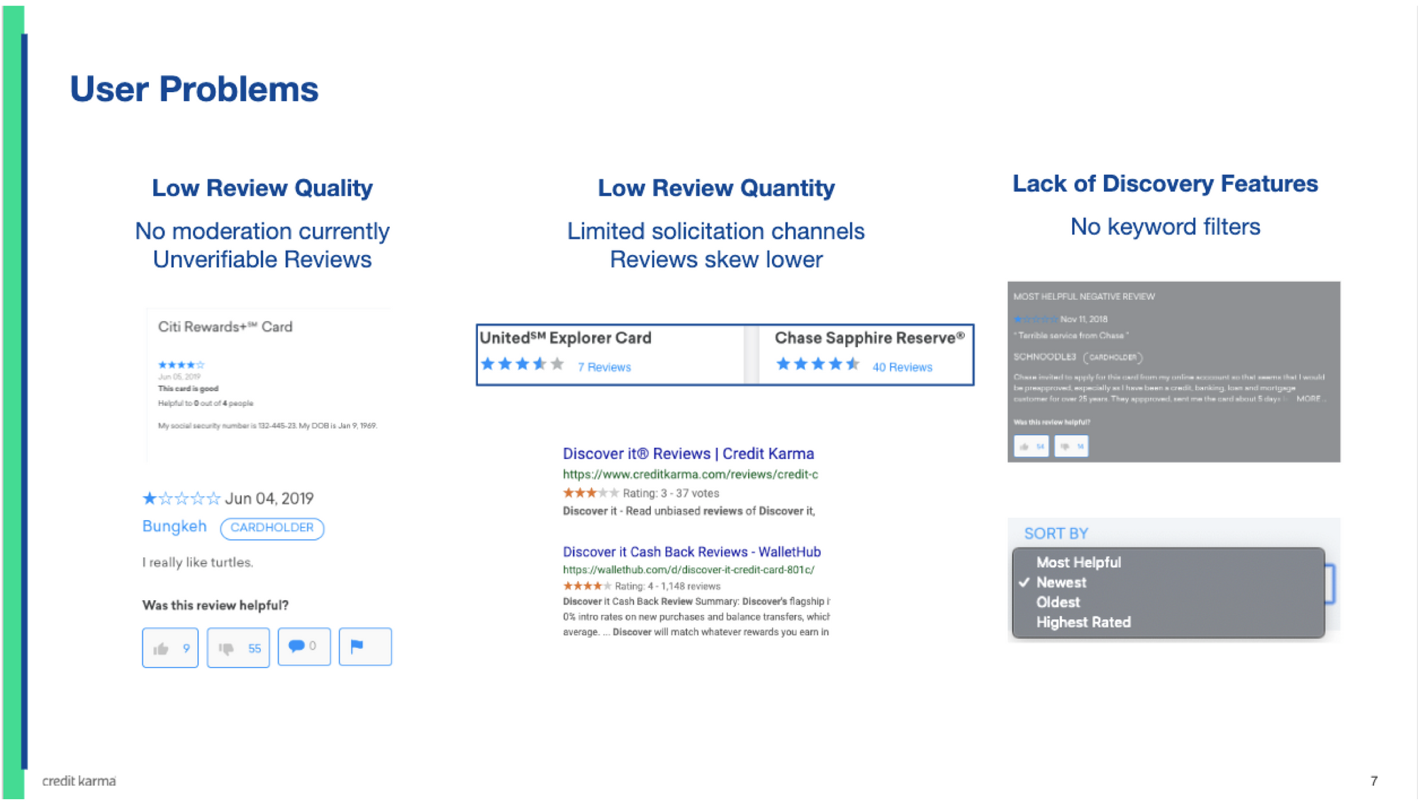
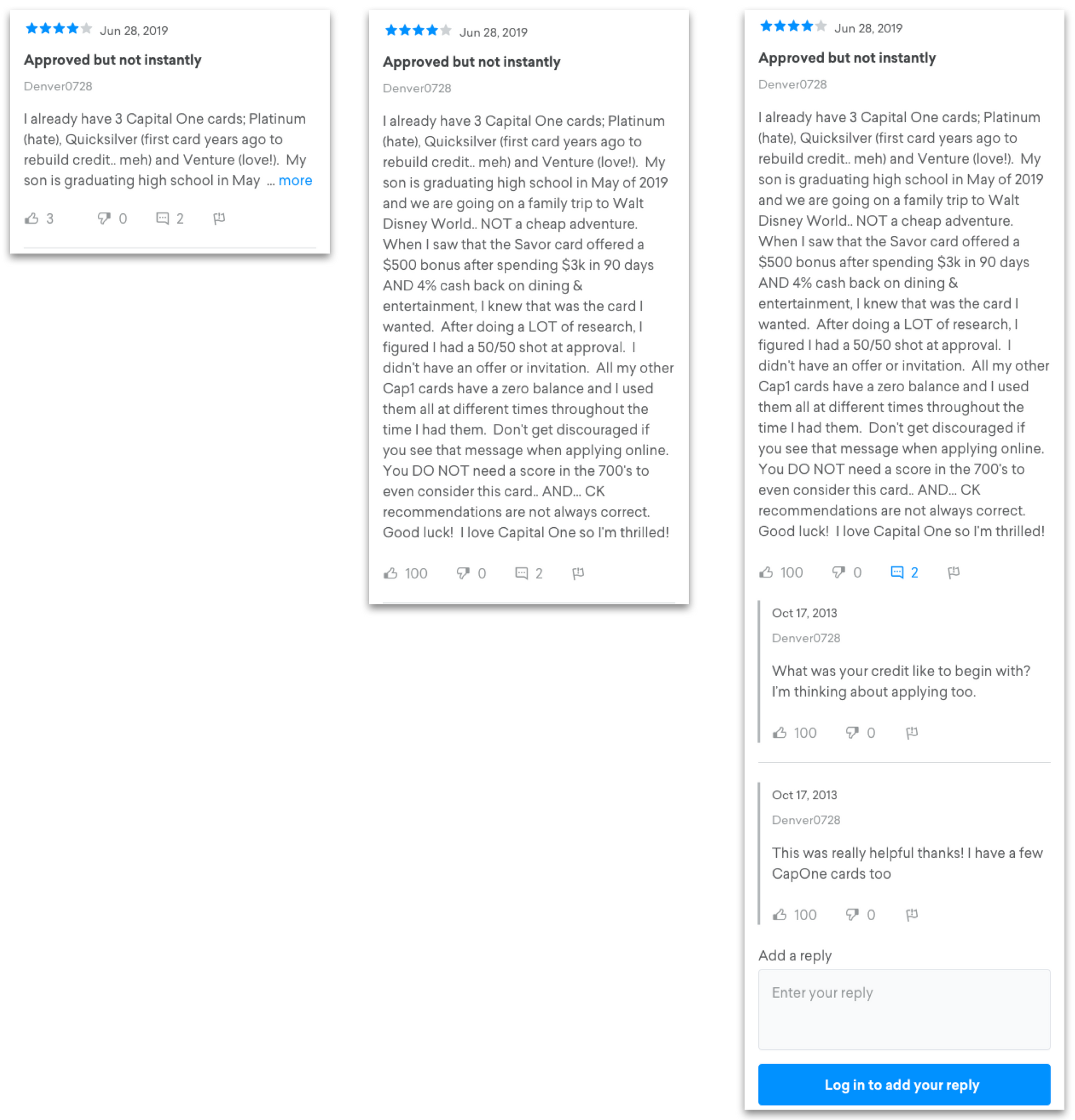
The product was also troublesome for our users. Our limited moderation meaning users could anonymously submit low quality reviews like this:
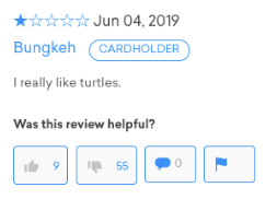
Our entire process was reactive which meant that garbage reviews would post directly to the all-important first page.
Duplicate reviews, fake reviews and reviews with unfair criticism plagued several products and tanked both ratings & conversions (who would want to apply for something that's rated 2 stars?)
Downward Trajectory
Despite the platform's tenacity, our lack of investment was starting to show. Even though Google highly prizes user generated reviews, our pages were losing popularity.
Credit Karma had missed the boat on several generations of new SEO rules. As a result, our average monthly revenue was in steady decline. Reviews in 2019 made ~$3M less per month compared to 2016.
Furthermore, we were losing reviews traffic to a number of competitors. Sites like nerdwallet and thepointsguy specialized in editorial content that described card benefits in detail.
Step 2: Plan
Now we were clear. User reviews are valuable and the platform has tremendous potential. However, it would be expensive to replace and was bound to a pressing deadline (CCPA).
If we were to replace and update the system, we would have to replace all of it, backend and frontend. The company was adamant in the need to move off the monolith. This would take far more resources and quarters than we could afford to spare. I had to get creative.
Third Party Vendors
I started researching third party vendors. We would be able to leverage their expertise in solving multiple clients' problems to bring a better product to market, faster. To evaluate, I set up sales calls with Yotpo, Bazaarvoice and Trustpilot.
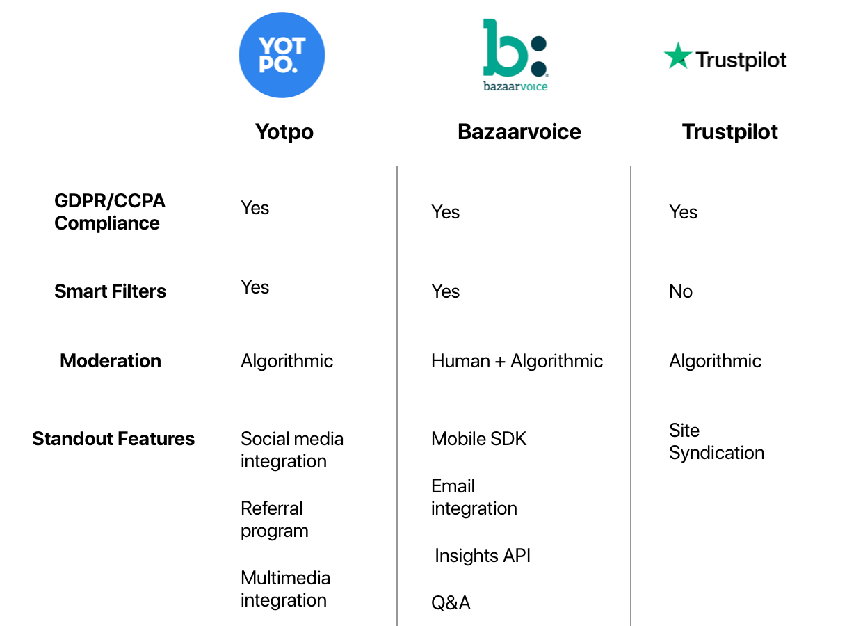
It was incredible! These companies had cost-friendly, ready-to-go services that were compliant with CCPA and had all the functionality that we currently had. They also offered several features that we couldn't even dream of replicating in-house. By using one of their offerings, we'd save almost 3 months of engineering work.
Granted, there would be a lot of unknowns to tackle since CK has never used external software in the main product, but it was well worth it if we could save reviews.
From the bat, Bazaarvoice showed us that they were miles ahead of the competition. I began to pull in engineers, security and SEO into our discussions with them. Our experts asked their Bazaarvoice counterparts the tough domain-specific questions and ensured that the plan would work.
After a lot of back-and-forth, our teams were satisfied and gave the OK to press ahead. Working together with our stakeholders, I wrote out the PRD and developed the roadmap to overhaul our user reviews.
It would be a multi-quarter effort implemented in 2 phases: phase I is parity, phase II is growth.
Phase I - Building parity and out-of-the-box features
The first step is building to parity. While the old system had a lot of shortcomings, it was still able to deliver solid core functionality. Even though I had grand plans for new functionality, our deadline meant that we needed to focus on fully capturing the original value proposition first.
Our primary goal:
Deliver a modern reviews platform before the Dec 31 CCPA deadline with all the things that our users liked about our old system while picking up as many new "low-hanging fruit" features as possible.

With this in mind, the following roadmap was made in collaboration with the engineering team who provided the time estimates.
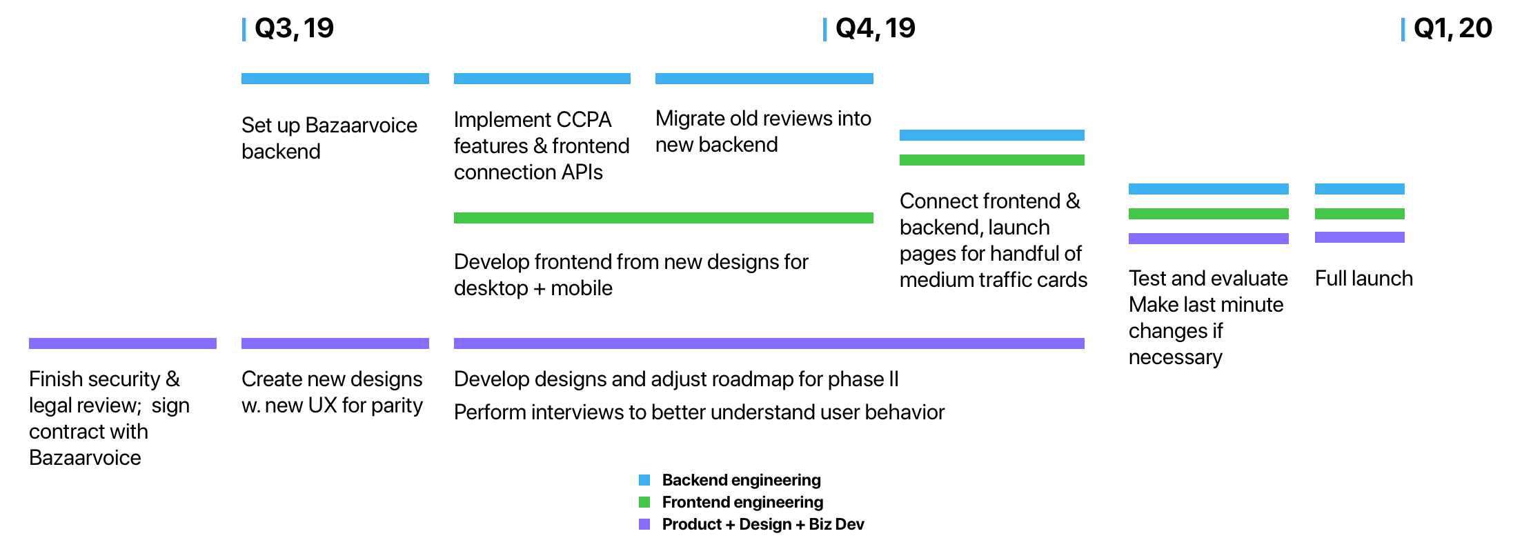
The objective accomplished with this roadmap is work parallelization. No team would be blocked. To ensure that our SEO is not disrupted, rollout would be incremental. By launching a handful of reviews pages, we can observe negative impacts and rectify them before a full launch.
Phase II - Building the future
With a stable platform, we can start engineering for growth. This rests on 3 main objectives:
1. Get more reviews
We'll first need an email feedback loop. CK users that are approved for cards will get contacted to provide their thoughts. For the first time ever, Credit Karma will be soliciting reviews from its users instead of waiting for volunteers.
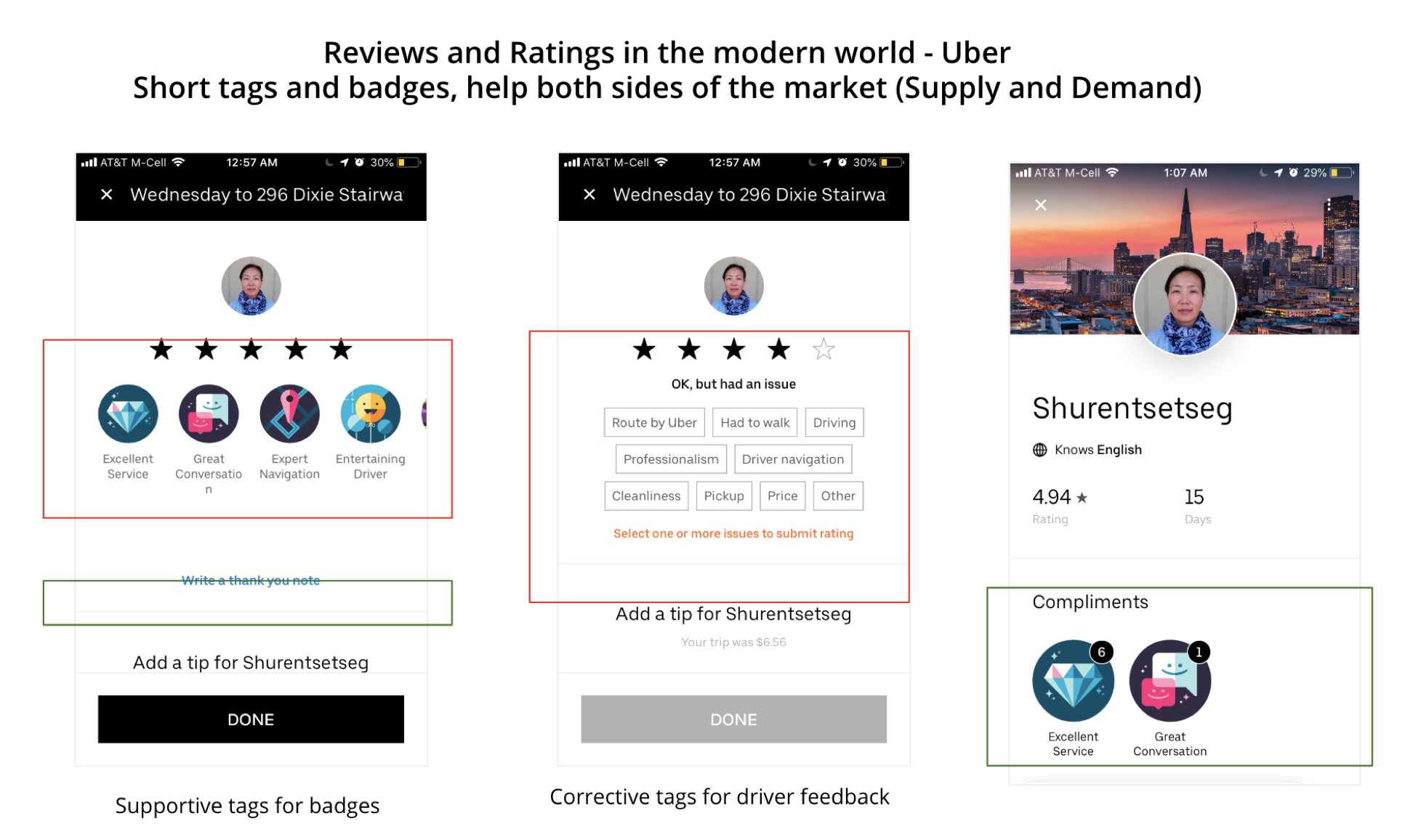
Following that, we'll take a page out of Uber's book and offer short tags + badges. We'll greatly increase quantity with a slight quality penalty which will in turn be mitigated by having old reviews and #2 below.
2. Merge all Credit Karma reviews content
From our competitors, we've seen that editorial content strikes a strong chord with potential cardholders, especially for premium cards. Thing is, Credit Karma already produces editorial content.
We have both a SEO cannibalization problem and a user experience problem. The ideal way to solve it is to combine the two onto a single page. Users will get the benefit of in-depth expert analysis on card benefits while simultaneously getting the organic opinions of other users.
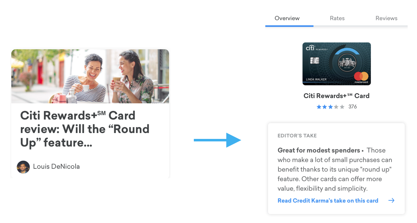
3. Personalize the shopping experience
The Credit Karma mission is to help our users make the correct product decisions with profit coming second. This means that our internal decision system (Recsys) will sometimes not show the Amex Platinum offer for users with incompatible spending habits even if they have the prerequisite credit score.
Once user reviews are modernized and accessible to the rest of the platform, we get access to a treasure trove of qualatative data to augment our recommendations.
Step 3: Campaign
Next step was to secure resources.
I, the intern, was now asking approval for a substantial budget in order to pay a third party vendor who would be running a non-trivial amount of our business. In this time of high demand & short supply for resources, it wasn't going to be easy.
OKR Process
Before a quarter starts, directors, PMs and engineers would sit down together to set up OKRs, assign priorities & allocate resources. This process is separate from budget, which is decided by executives.
We started planning for Q3 in June, at the end of my first month at CK.
At that point, I had the results of a full investigation, a shiny new PRD and absolutely no devs or designers. The project was too radical, too new and I did not have the sway to convince our org to invest.
But still, I had to keep pushing. If we missed the bus this quarter, reviews would end as a product. I worked with the director of engineering to change the scope and roadmap so that it would fit our resource constraints. By negotiating with the other PMs, I was able to get 2 engineers part-time.
If we got budget approval, I would be allowed to run a proof of concept for reviews. The project was lowest priority (P3) - but it was something!
The hope was that results the PoC would generate enough momentum for the company to double down in Q4.
Pitching to the Executives
It was now time to secure funding. Backed by both my manager Peter and our director Ambrish, we decided to go on a campaign to convince the executive team to invest in this plan.
I am incredibly grateful that they placed their trust in me and gave me full autonomy. For all these meetings, I prepared the content and delivered the pitch.
Driven, I brought my A-game to these meetings. All the evidence we collected + the polished strategy combined in an easy-to-digest package delivered with pizzazz.
We brought the pitch to the CTO, CLO, CRO and the GM of our vertical, receiving great feedback from everyone involved. Some small tweaks were needed but it was approved!
However, things changed rapidly.
The day before the OKRs were finalized, resources got shuffled around and reviews got cut. I was incredibly discouraged. This meant that user reviews would probably be shut down and all that work would have been for nothing.
Dejected, I got into the office the next day and for our final OKR meeting. It would start with a review of all the finalized projects and priorities for Q3.
At the very bottom, it read:
User Reviews Overhaul : Priority 0
I thought I was hallucinating. It wasn't even on the board last night!
To my immense surprise, the user reviews overhaul got a manual override from the executives the night before. My investigation had shed new light on the product while the quality of the plan & pitch gave them confidence in the project's success.
Funding was approved, a team of designers and engineers was allocated and its priority was set. By doing the work, we had won the company's support!
Step 4: Execute
Now, I was actually very out of my depth. Never in my career had I managed such a massive project or team before. But because the team was depending on me, I grew to meet their expectations.
There was a lot to coordinate. We had tight deadlines that could only be hit if nobody got blocked. There were 3 things to get done:
Designs
I worked with our project's main designers Banafsheh and Joyce to figure out which features from the old platform to promote/cut.
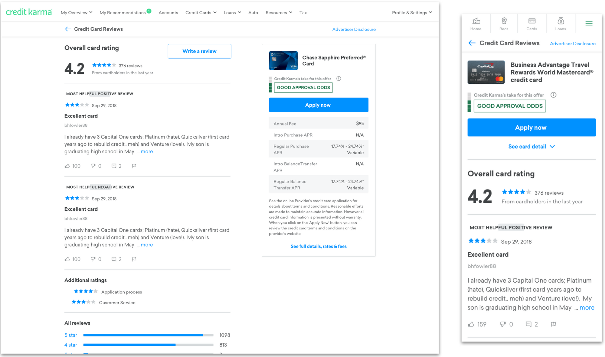
Though most of the benefits from the new frontend were unseen to the users (new SEO, A/B testing, moderation, CCPA compliance, etc.), we also took the opportunity to improve the pages for a better user experience.
On desktop, anchoring the product offer and details on the right side of the screen gives our users an easy way to reference information while they're reading reviews. If they commit to applying for the product, the "Apply Now" button is easily accessible without any scrolling.
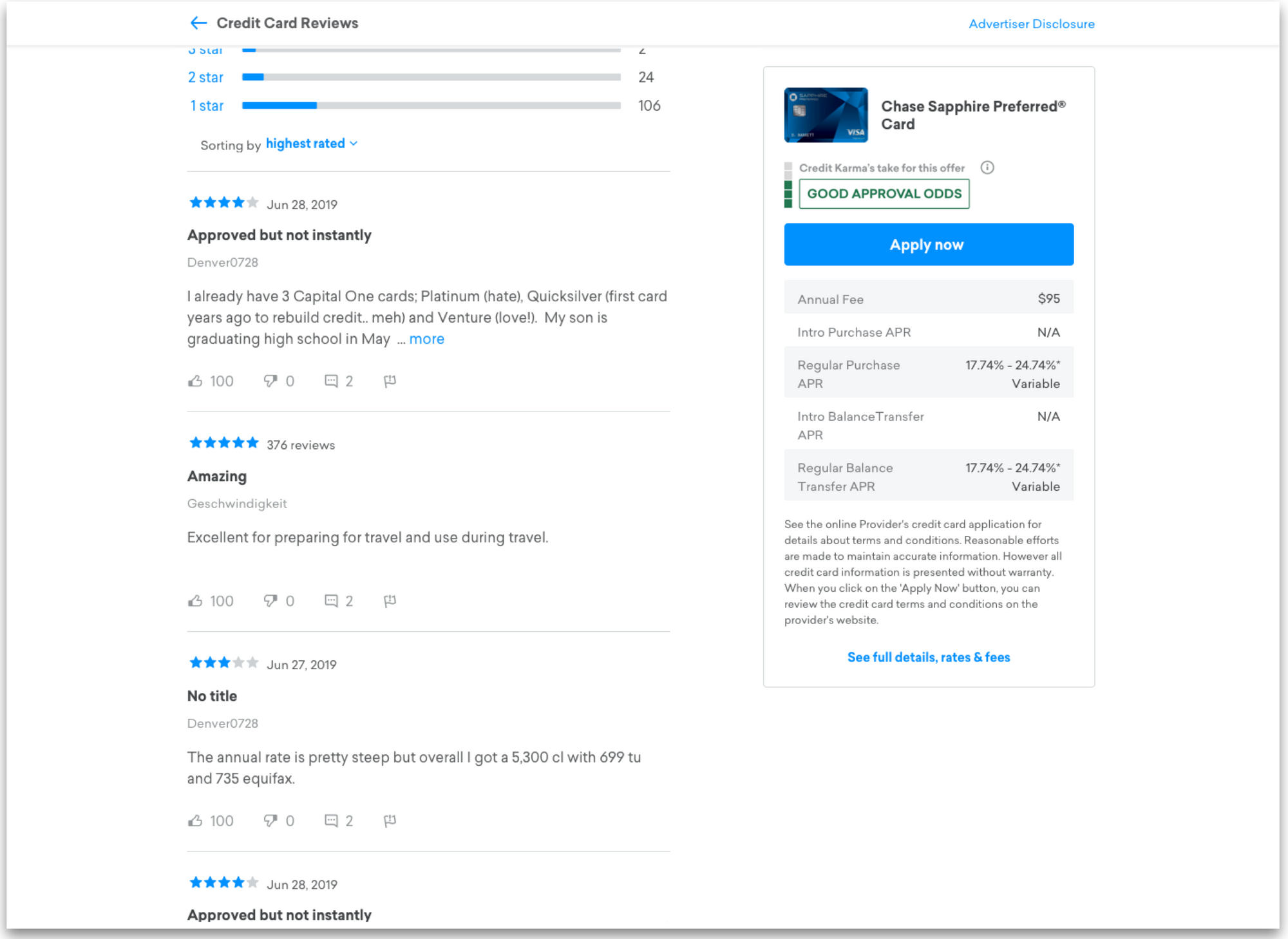
On mobile, default behavior for anything that took up a lot of space (submit comment, load replies, card details) became tap to expand. While it was a small change, it helped reduce visual clutter and improved ease of browsing.
Finally, for expired offers (cards temporarily inactive on Credit Karma), we developed a flow to recommend other similar cards. Users could still read the reviews and we would be able to capture some of the bounce traffic.
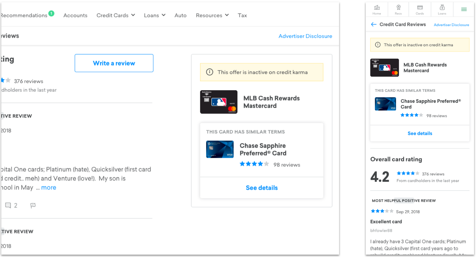
Everything in these design was also made modular to make it compatible with the new user-facing features expected in phase II.
Signing the Deal
Before the new quarter started, I had to push the Bazaarvoice partnership through security clearance, legal review and pricing negotiations. The executives had approved the project and our team had made sure there were no dealbreakers - now was time for the details.
To ensure that engineers could start on time, everything had to happen FAST. Over the course of 1 week, I logged 82 meetings with more than 50 people. Our teams needed to sync our concerns/demands/concessions while simultaneously relaying information to and from Bazaarvoice.
To get all this done, I had to get the right people in the room. Everyone involved in the project needed a clear understanding of exactly what we wanted to accomplish and what we needed from them. To do this, I set up a slack channel for the project and communicated all movements to the extended team.
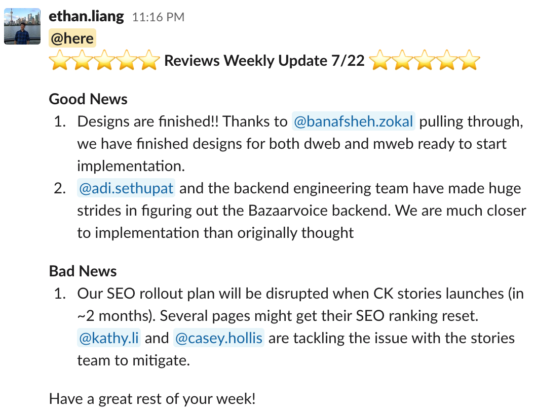
This channel kept everyone aligned on our progress & vision and stakeholders got news almost as soon as I did. Q&A relevant for the whole team would be held in the channel. This open forum frequently gave us gold when people would volunteer solutions to problems that we encountered.
Overall, it was the best possible crash course to making B2B sales. On July 31, 2019, we successfully signed the contract with Bazaarvoice.
Engineering and Handoff
Development started as I was nearing the end of my internship. With the designs, roadmap, and PRD prepared + contract signed, the pressure was off the product team.
There was still work to do though. I worked closely with our engineering manager Adi to resolve issues as they came up. Much of the work revolved around connecting technical teams from different verticals to resolve platform compatibility problems. A new backend meant new integrations.
The end of my internship also meant that I needed to handoff the project to one of my teammates: Kaitlyn. We held several crash courses in the work so far and she began to take over all of the reviews work.
Key Learnings and Final Words
Throughout the whole experience, there were some key lessons that stuck with me.
Do the due diligence
Everything that I accomplished at CK was possible because I took the time to get to the bottom of things. If I hadn't really looked into the data, it wouldn't have been evident that reviews was still relevant. Similarly, not researching third party vendors would have meant either a cancelled product or an enormous amount of resources being spent to do it in-house.
Communication is vital
A good product manager should always strive to communicate as much as possible with the people they're working with. The openness of communication on my team ensured that when people had thoughts, ideas or concerns, they didn't hesitate to share and start discussions.
Everyone who was involved knew what was going on during the entire process.
Hustle to grow
During this entire process, I was non-stop intimidated. I had fantastic support from my teammates but there was some real pressure. For the first time, there was no safety net - if I failed, the entire project would be in jeopardy.
But people can't grow without a sense of risk and sometimes you need to be underqualified so you can strive to reach a new level.
***
All in all, it was an incredibly rewarding experience and a unrivalled learning opportunity. I'm very grateful to my team for trusting me with the responsibility of such a huge project!
